Plotting
Contents
Plotting Methods
Network plotting abilities are implemented as methods of the Network class. Some of the plotting functions of network s-parameters are,
Similar methods exist for Impedance (Network.z) and Admittance Parameters (Network.y),
Step-by-step examples of how to create and customize plots are given below.
Complex Plots
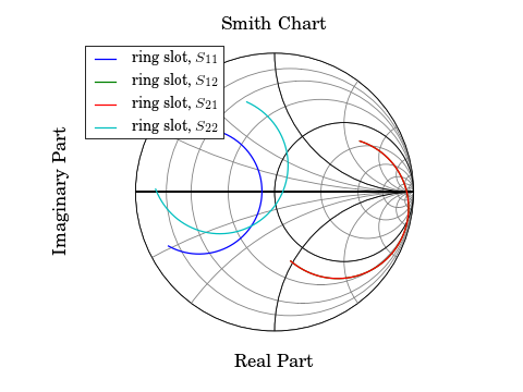
Smith Chart
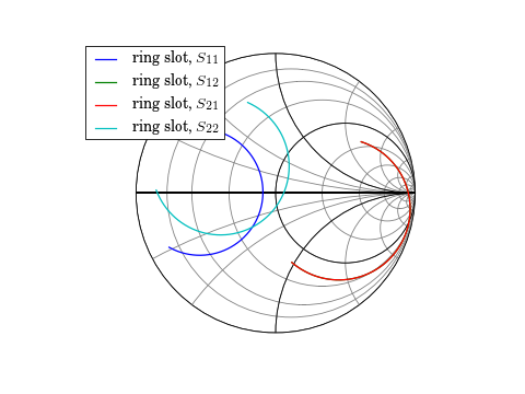
As a first example, load a Network from the data module, and plot all four s-parameters on the Smith chart.
In [1]: import skrf as rf

In [2]: from skrf.data import ring_slot

In [3]: ring_slot
 Out[3]: 2-Port Network: 'ring slot',  75-110 GHz, 501 pts, z0=[ 50.+0.j  50.+0.j]

In [4]: ring_slot.plot_s_smith()
Note
If you dont see any plots after issuing these commands, then you may not have started ipython with the --pylab flag. Try from pylab import * to import the matplotlib commands and ion() to turn on interactive plotting. See this page , for more info on ipython’s pylab mode.
Note
Why do my plots look different? See Formating Plots
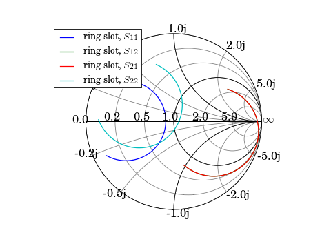
The smith chart can be drawn with some impedance values labeled through the draw_labels argument.
In [1]: figure();

In [2]: ring_slot.plot_s_smith(draw_labels=True)
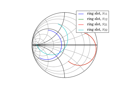
Another common option is to draw addmitance contours, instead of impedance. This is controled through the chart_type argument.
In [1]: figure();

In [2]: ring_slot.plot_s_smith(chart_type='y')
See smith() for more info on customizing the Smith Chart.
Note
If more than one plot_s_smith() command is issued on a single figure, you may need to call draw() to refresh the chart.
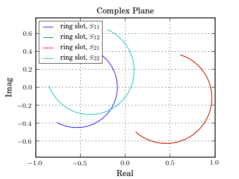
Complex Plane
Network parameters can also be plotted in the complex plane without a Smith Chart through Network.plot_s_complex().
In [1]: figure();

In [2]: ring_slot.plot_s_complex();
Rectangular Plots
Log-Magnitude
Scalar components of the complex network parameters can be plotted vs frequency as well. To plot the log-magnitude of the s-parameters vs. frequency,
In [1]: figure();

In [2]: ring_slot.plot_s_db()
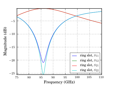
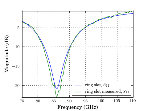
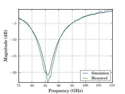
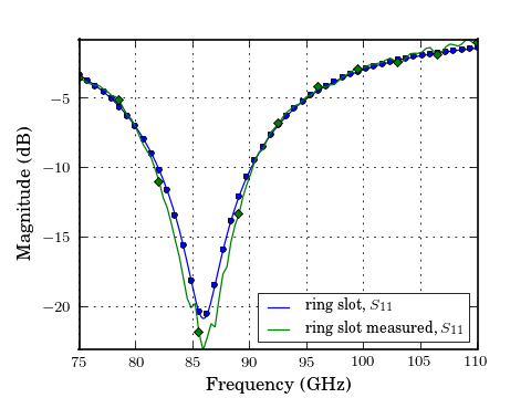
When no arguments are passed to the plotting methods, all parameters are plotted. Single parameters can be plotted by passing indecies m and n to the plotting commands (indexing start from 0). Comparing the simulated reflection coefficient off the ring slot to a measurement,
In [1]: from skrf.data import ring_slot_meas

In [2]: figure();

In [3]: ring_slot.plot_s_db(m=0,n=0) # s11

In [4]: ring_slot_meas.plot_s_db(m=0,n=0) # s11
See Customizing Plots for more information on customization.
Phase
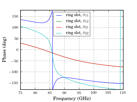
Plot phase,
In [1]: figure();

In [2]: ring_slot.plot_s_deg()
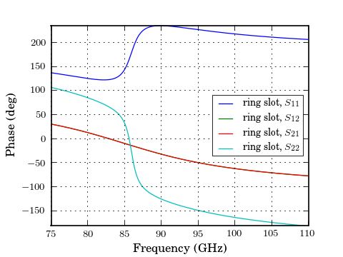
Or unwrapped phase,
In [1]: figure();

In [2]: ring_slot.plot_s_deg_unwrap()
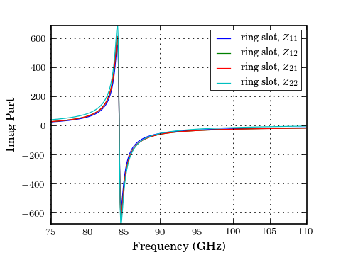
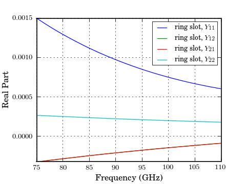
Impedance, Admittance
The components the Impendanc and Admittance parameters can be plotted similarly,
In [1]: figure();

In [2]: ring_slot.plot_z_im()
In [1]: figure();

In [2]: ring_slot.plot_y_re()
Customizing Plots
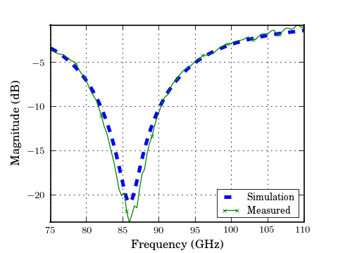
The legend entries are automatically filled in with the Network’s name. The entry can be overidden by passing the label argument to the plot method.
In [1]: figure();

In [2]: ring_slot.plot_s_db(m=0,n=0, label = 'Simulation')

In [3]: ring_slot_meas.plot_s_db(m=0,n=0, label = 'Measured')
The frequency unit used on the x-axis is automatically filled in from the Networks frequency attribute. To change the label, change the frequency’s unit.
In [1]: ring_slot.frequency.unit = 'mhz'
Other key word arguments given to the plotting methods are passed through to the matplotlib plot() function.
In [1]: figure();

In [2]: ring_slot.plot_s_db(m=0,n=0, linewidth = 3, linestyle = '--', label = 'Simulation')

In [3]: ring_slot_meas.plot_s_db(m=0,n=0, marker = 'x', markevery = 10,label = 'Measured')
All components of the plots can be customized through matplotlib functions.
In [1]: figure();

In [2]: ring_slot.plot_s_smith()

In [3]: xlabel('Real Part');

In [4]: ylabel('Imaginary Part');

In [5]: title('Smith Chart');

In [6]: draw();
Saving Plots
Plots can be saved in various file formats using the GUI provided by the matplotlib. However, skrf provides a convenience function, called save_all_figs(), that allows all open figures to be saved to disk in multiple file formats, with filenames pulled from each figure’s title:
>>> rf.save_all_figs('.', format=['eps','pdf'])
./WR-10 Ringslot Array Simulated vs Measured.eps
./WR-10 Ringslot Array Simulated vs Measured.pdf
Misc
Adding Markers to Lines
A common need is to make a color plot, interpretable in greyscale print. There is a convenient function, add_markers_to_lines(), which adds markers each line in a plots after the plot has been made. In this way, adding markers to an already written set of plotting commands is easy.
In [1]: figure();

In [2]: ring_slot.plot_s_db(m=0,n=0)

In [3]: ring_slot_meas.plot_s_db(m=0,n=0)

In [4]: rf.add_markers_to_lines()
Formating Plots
It is likely that your plots dont look exactly like the ones in this tutorial. This is because matplotlib supports a vast amount of customization. Formating options can be customized on-the-fly by modifying values of the rcParams dictionary. Once these are set to your liking they can be saved to your .matplotlibrc file.
Here are some relevant parameters which should get your plots looking close to the ones in this tutorial:
my_params = {
'figure.dpi':  120,
'figure.figsize': [4,3],
'figure.subplot.left' : 0.15,
'figure.subplot.right'      : 0.9,
'figure.subplot.bottom'     : 0.12,
'axes.titlesize'    : 'medium',
'axes.labelsize'    : 10 ,
'ytick.labelsize'   :'small',
'xtick.labelsize'   :'small',
'legend.fontsize'   : 8  #small,
'legend.loc'            : 'best',
'font.size'         : 10.0,
'font.family'       : 'serif',
'text.usetex' : True,    # if you have latex
}

rcParams.update(my_params)
The project mpltools provides a way to switch between pre-defined styles, and contains other useful plotting-related features.